North Star Land Solutions
Brand Identity & Application
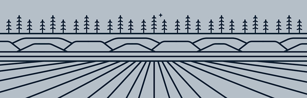
As North Star continued to grow, they needed a refreshed identity that would distinguish them from the many companies sharing the same name while making their connection to land immediately clear. Through research into the company, its audience, and the different types of land they work with (timber/forest, mountains/hills, agricultural/fields and oil/gas/minerals), I developed an identity that feels established and distinctive while staying rooted in the landscapes at the heart of their business.
The new mark brings several land elements together within an oval landscape, topped by a North Star. The result is a more ownable identity that connects the North Star name to the land solutions they provide.




Contribution: Sole designer for this concept, developing the refreshed identity from research, concept development and sketches to application and the first client presentation.
Role: Junior Designer at White Unicorn Agency